Dark patterns. How interfaces steal your time, money, and data.
Good UX is honest UX.
Not really.
Half the products you use every day are designed so you do what the business wants, not what you want. This isn't a bug. It's a feature. Designers have a name for it: dark patterns. Harry Brignull mapped them out in 2010 and runs the catalog at deceptive.design.
Twenty patterns you bump into every week. By family.
01 / Hidden costs
The checkout surprise.
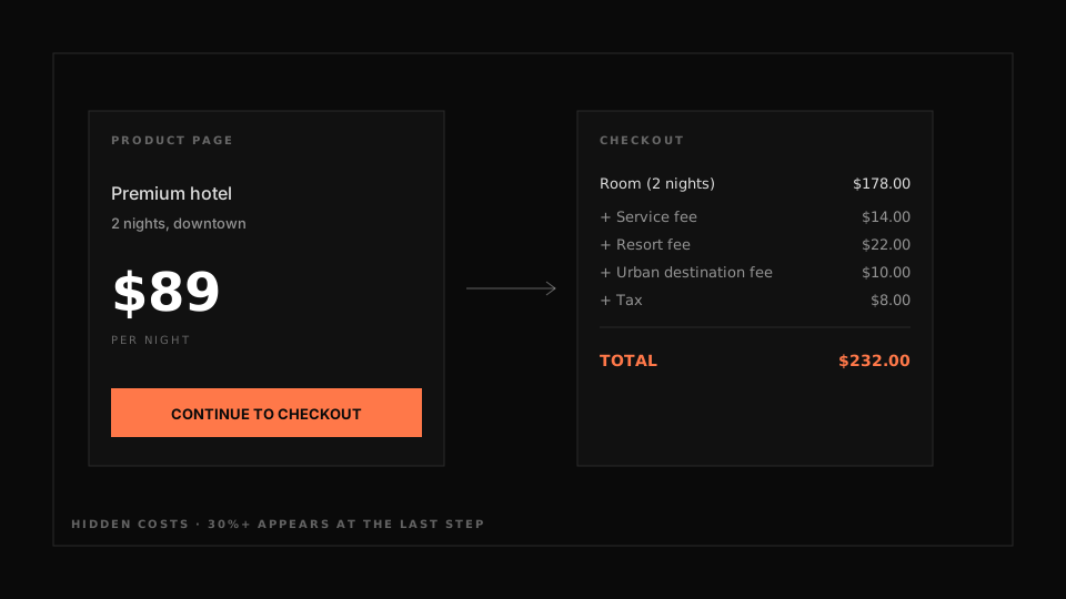
Price on the page: $89. At checkout: $112. Service fee, processing fee, bullshit fee. Resort fee, urban destination fee. EU regulates this through the Digital Services Act. From January 2024 the displayed price must include all mandatory fees. Fines are still symbolic, so companies keep doing it.
02 / Sneak into basket
Things you didn't ask for, in your cart.
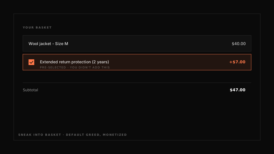
You added a $40 jacket. At checkout an "extended return protection" is pre-checked at $7. EU consumer surveys in 2023 found this in roughly 30% of fashion checkouts. Default greed, monetized.
03 / Bait and switch
The promise wasn't the product.
"Get free trial" → enter card → fine print: "$49 charged after 7 days unless cancelled." The promise was free, the action triggered a paid path. Microsoft was sued in 2016 over Windows 10 upgrade prompts where clicking the X to close counted as consent.
04 / Forced continuity
Auto-renewal you'll forget.
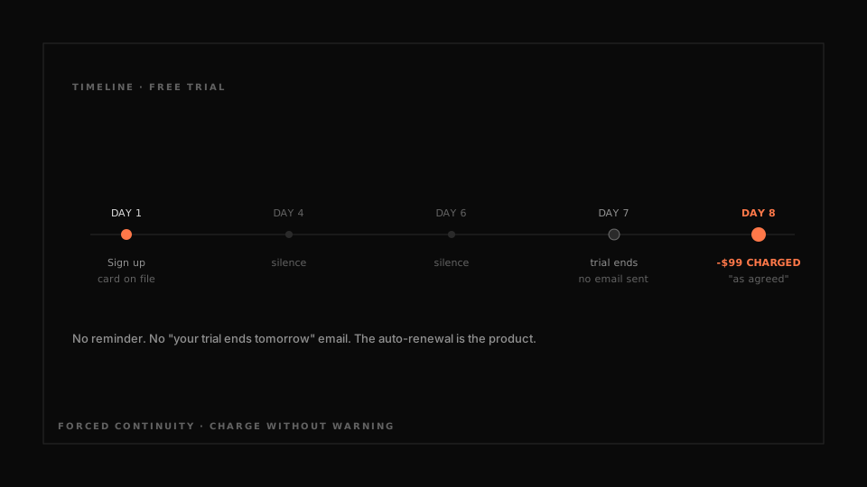
Free trial. No reminder before the charge. Day 8 - $99 gone. The FTC sued Adobe in 2024 over hidden cancellation fees on annual subscriptions disguised as monthly billing.
05 / Confirmshaming
They shame you for saying no.
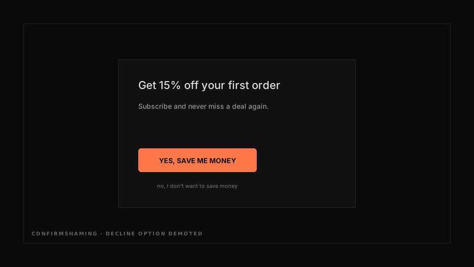
Popup: "Subscribe for deals!" Two buttons. Yes, save me money - bright, green, in your face. No, I don't want to save money - tiny, gray, bottom of the modal. Most people just click yes to make the tone go away.
06 / Manufactured urgency
Fake countdowns.
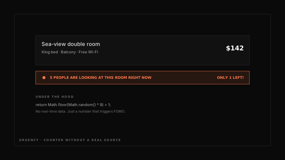
5 people are looking at this room right now. Only 1 ticket left at this price. Booking got a warning from the EU Commission in 2019 - part of those counters weren't from real data. Pure RNG. Works through FOMO. Works even on people who know how it works.
07 / Fake social proof
Invented testimonials.
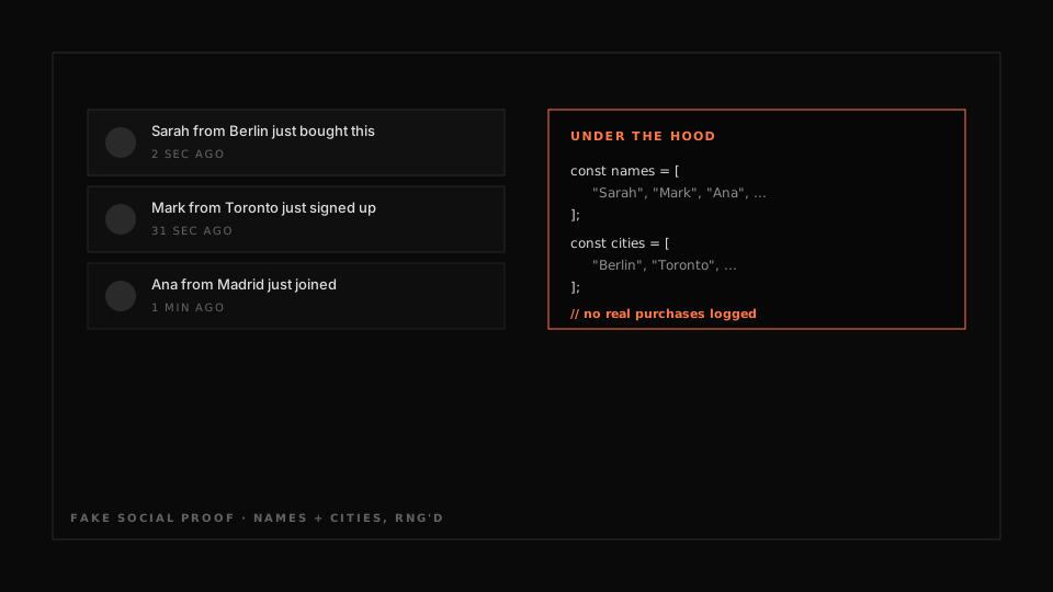
"Sarah from Berlin just bought this!" Notification slides in every 30 seconds. The data is fake. Most "social proof" plugins on Shopify generate from a name list and a city list. No real purchases happening, just RNG.
08 / Nagging
They wear you down.
You said no to the email signup. Three pages later, same popup. After cookies set, the "no" expires in 24 hours. Some sites refresh the prompt every session. Persistent enough that you eventually cave.
09 / Roach motel
Easy to enter, impossible to leave.
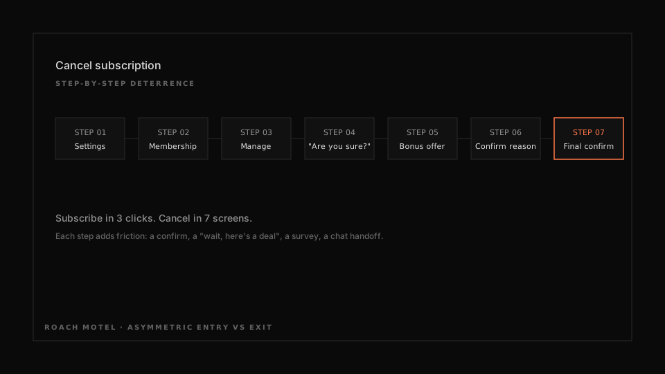
Subscribe: three clicks. Cancel: seven screens, a support chat, a call to your bank. The FTC sued Amazon in 2023 - court docs revealed an internal project called Iliad (the long Greek epic). Designers were asked to deliberately complicate the cancellation flow. Not an accident.
10 / Disguised unsubscribe
The link you can't find.
Unsubscribe is gray-on-gray, 9px, at the bottom of an 800px-tall email. Or "Manage preferences" → seventeen toggles → "Save changes" → confirmation popup. CAN-SPAM and GDPR both require easy unsubscribe. Still everywhere.
11 / Privacy maze
Settings scattered across six menus.
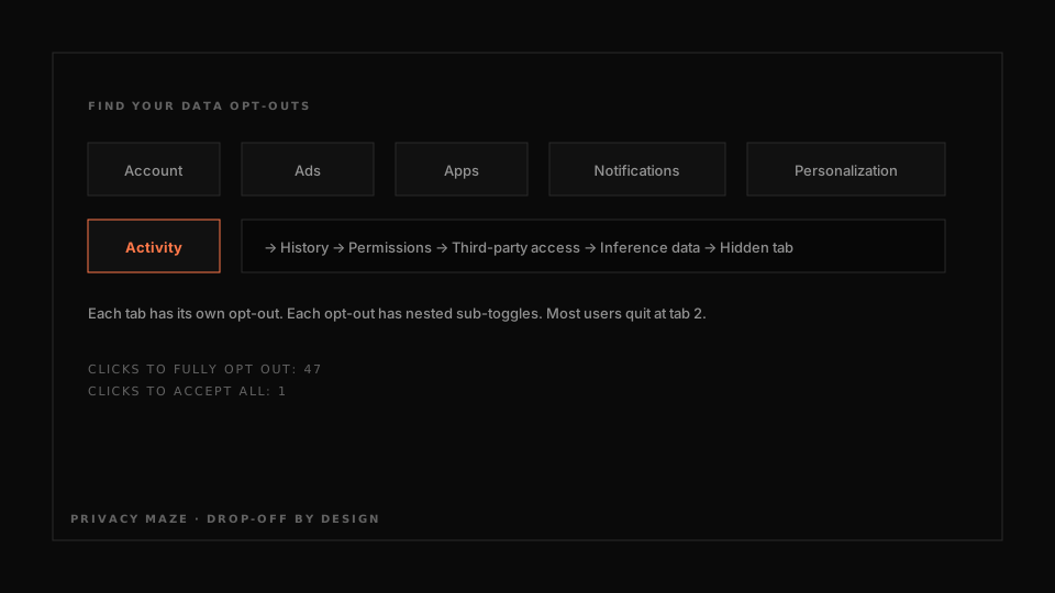
"Adjust privacy" → Account, Ads, Apps, Notifications, Personalization, Activity. Six tabs, each with their own opt-out. By design - discouraging users from completing the full opt-out journey.
12 / Cookie consent maze
One-click yes, twenty-click no.
"Accept all" - one big button, top right. "Reject all" - hidden behind "Manage preferences" → 47 vendor toggles → "Save changes". GDPR enforcement letters in 2023-2024 specifically called out this asymmetry as a violation.
13 / Forced enrollment
Account before content.
You wanted one article. The site demands email signup before the page loads. Or "Continue with Google" is the only visible option - email signup hidden behind a tiny gray link.
14 / Friend spam
Your address book gets weaponized.
LinkedIn settled a $13M class action in 2015 over "Add Connections" - the feature pulled users' entire address books and sent invites to all contacts as if from the user. Legally framed as opt-in. Almost nobody understood what they consented to.
15 / Privacy zuckering
Defaults that leak more than you expect.
Defaults set to maximum data collection. Settings can be tightened, but you have to know they exist. Facebook ran this playbook for years - posts default to "everyone" instead of "friends," ad personalization on by default, location tracking quietly enabled.
16 / Forced disclosure
Required fields with no relation to the service.
Signup asks for phone, address, birthday, gender, household size, occupation. None of it required to deliver the service. All of it sold to data brokers or fed to ad targeting. The required-field asterisk doesn't ask why.
17 / Misdirection
The design already decided.
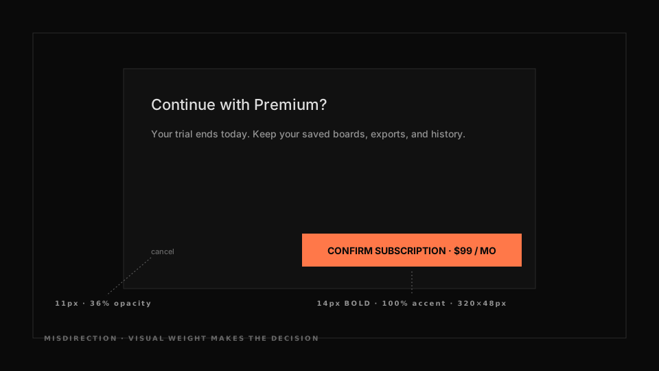
Cancel - tiny, gray, on the left. Confirm subscription at $99/mo - big, colored, on the right. You haven't decided anything yet - the design already decided for you. This isn't called manipulation in the industry. It's "good visual hierarchy."
18 / Preselection
Default opt-ins.
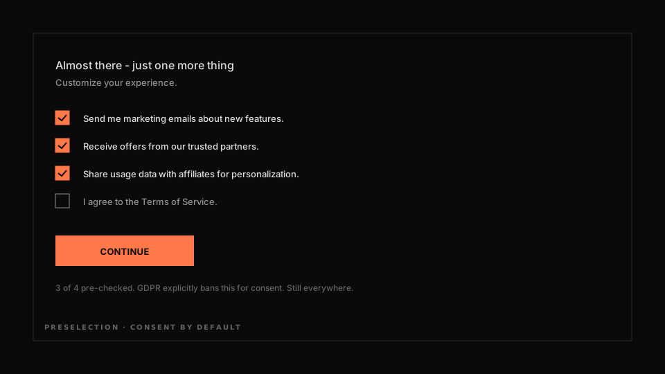
Five checkboxes on signup. Three pre-checked: marketing emails, partner offers, data sharing with third parties. You miss them, sign up, leak. GDPR explicitly bans pre-ticked boxes for consent. Enforcement is patchy outside major regulators.
19 / Visual interference
Important info, deliberately hard to read.
Fee disclosure rendered at 8px gray-on-gray. The decline button styled as if disabled. Critical terms behind "Learn more" that doesn't render on mobile. Anti-readability is a design choice, not an accident.
20 / Trick questions
Double negatives in checkboxes.
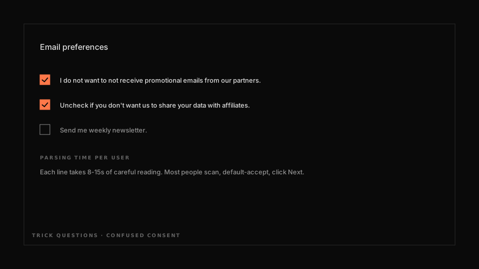
Checkbox: I do not want to not receive emails. Yes or no? Written that way on purpose so you fumble and tick "in favor of" the service. Classic case: free software installers. Toolbar, browser hijacker, antivirus trial - all bundled under one big "Next" and three confusing boxes.
The worst part - none of this is a mistake. Not "bad UX." It's deliberate design. Metric first, interface second. Conversion ↑, NPS ↓ three months later. But nobody checks NPS in a sprint review.
What do you do as a designer? Say no, with conviction, when a brief tries to turn you into a mechanic for stealing time and money. In 2024 the EU sues for this. In 2025 - the US. The debt comes due eventually.
For now, just notice. Next time you see a button labeled "No thanks, I love overpaying" - remember it's not an accident. It's the work.